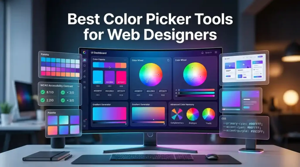
The best color picker tools for web designers include Adobe Color, Coolors, Color Hunt, and browser-based eyedroppers. These tools help extract HEX, RGB, and HSL values, generate harmonious color palettes, and ensure WCAG accessibility compliance. Most are free and integrate seamlessly with Figma, CSS workflows, and design systems.
Introduction: Why Color Pickers Matter More Than You Think
Color is the first thing users notice — and the first thing they judge. A mismatched palette can make a polished website feel amateurish. An inaccessible contrast ratio can fail WCAG guidelines and alienate 8% of male users who have color vision deficiency.
That’s why professional web designers don’t guess colors. They use color picker tools to extract exact values, build consistent palettes, and maintain brand integrity across every digital touchpoint.
Whether you’re building a SaaS dashboard, an ecommerce store, or a personal portfolio, the right color picker tool will save you hours and elevate your visual design.
Try a Free Color Picker Right Now
→ Use MegaFreeTools Free Color Picker
Pick any color, get its HEX, RGB, and HSL codes instantly — no sign-up, no download required. It solves the problem of manually hunting for color codes by letting you select, convert, and copy values in seconds.
What Is a Color Picker Tool?
A color picker tool is a digital utility that lets designers and developers select a color from a visual spectrum, image, or screen, and obtain its precise color code — typically in HEX (#FF5733), RGB (255, 87, 51), or HSL (14°, 100%, 60%) format.
These tools range from simple browser-based selectors to advanced palette generators with accessibility checkers and AI-powered suggestions.
According to Mozilla’s Web Docs, the HTML <input type="color"> element is natively supported across all modern browsers — but professional design work demands far more control than a basic browser input can offer.
Why Web Designers Need Dedicated Color Tools
Working without a proper color picker creates real problems:
- Inconsistent brand colors across pages and components
- Failed accessibility audits due to poor contrast ratios
- Slow workflow caused by manually typing hex codes
- Broken design systems when teams use slightly different shades
A dedicated tool eliminates all of these. Many designers pair their color picker with a free online notepad to log color values, or use a word counter when documenting their design system guidelines.
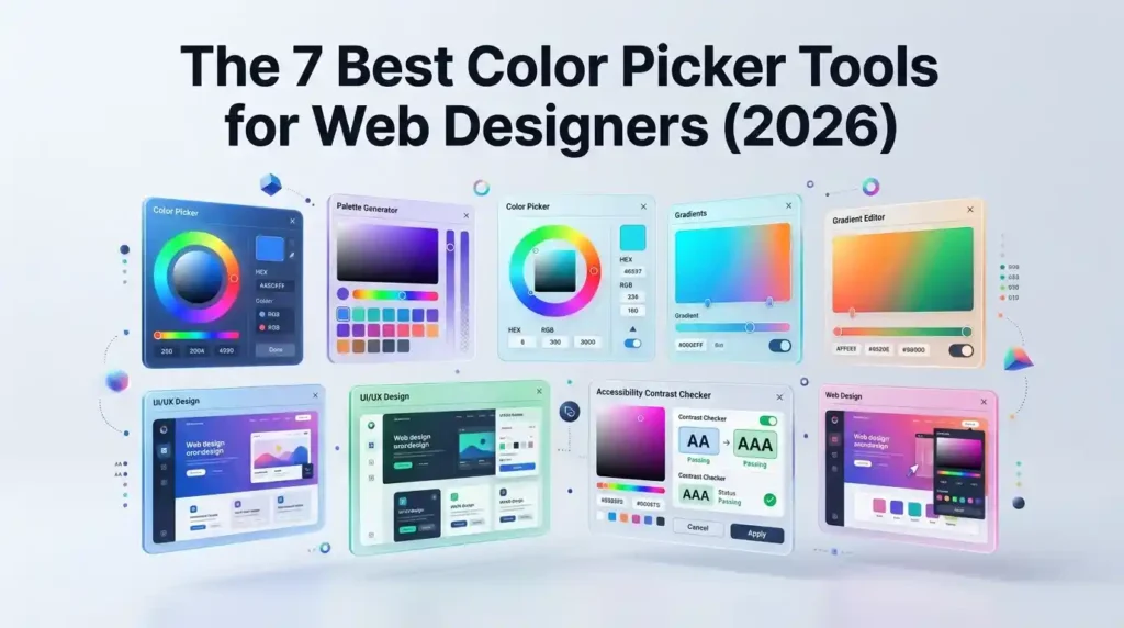
The 7 Best Color Picker Tools for Web Designers (2026)
1. MegaFreeTools Color Picker — Best Free Browser Tool
MegaFreeTools Color Picker is a fast, no-login color selection tool built for designers who need quick HEX and RGB values without friction. It’s ideal for freelancers and beginners who need instant results.
Best for: Quick color lookups, converting HEX to RGB, everyday design work Cost: 100% Free
2. Adobe Color — Best for Color Theory & Harmony
Adobe Color (formerly Adobe Kuler) is the industry standard for color harmony exploration. Built on color theory principles like complementary, analogous, triadic, and monochromatic schemes, it’s trusted by professional designers worldwide.
Standout Features:
- Interactive color wheel with harmony rules
- Accessibility checker (WCAG AA/AAA compliance)
- Direct integration with Adobe Creative Cloud
- “Extract Theme” from uploaded images
Best for: Brand color strategy, design system creation, accessibility validation Cost: Free (Adobe account optional for saving)
3. Coolors — Best Palette Generator
Coolors is the go-to color palette generator for designers who need beautiful, cohesive multi-color schemes fast. Press the spacebar and it generates a new 5-color palette instantly.
Standout Features:
- One-click palette generation and locking
- Export to HEX, RGB, CSS, SVG, and more
- Contrast checker built-in
- Figma and Adobe plugin available
Best for: Creating complete color palettes for branding projects, UI mockups Cost: Free (Pro plan available)
4. Color Hunt — Best for Curated Inspiration
Color Hunt is a community-driven color palette library with thousands of hand-picked, trending palettes. It’s less of a generator and more of a discovery tool.
Best for: Finding trendy color combinations, design inspiration Cost: 100% Free
5. Canva Color Wheel — Best for Beginners
Canva’s color wheel is beginner-friendly and teaches color theory while helping you pick colors. It shows complementary, analogous, and triadic relationships in plain language.
Best for: Non-designers, content creators, social media managers Cost: Free
6. Chrome DevTools Color Picker — Best for Frontend Developers
Built into Chrome’s inspector panel (F12 → click any color value), this is the fastest screen color picker for developers. It supports HEX, RGB, HSL, and HSLA natively, and lets you sample colors directly from the rendered webpage.
According to Google’s Chrome DevTools documentation, the color picker inside DevTools supports eyedropper sampling, value conversion, and opacity controls — no extension required.
Best for: Frontend developers, CSS debugging, extracting colors from live websites Cost: Free (built into Chrome)
7. Figma Color Picker — Best for UI/UX Designers
If you design in Figma, its built-in color picker and style system is indispensable. You can define color styles, share them across a team library, and maintain consistency across all components.
Best for: Product designers, UX teams, collaborative design systems Cost: Free plan available
Pros & Cons: Top Color Picker Tools Compared
| Tool | Best For | Accessibility Check | Free? | Export Options |
|---|---|---|---|---|
| MegaFreeTools Color Picker | Quick lookups | No | ✅ Yes | HEX, RGB |
| Adobe Color | Color harmony | ✅ Yes (WCAG) | ✅ Yes | Multiple |
| Coolors | Palette generation | ✅ Yes | ✅ Yes | CSS, HEX, SVG |
| Color Hunt | Inspiration | No | ✅ Yes | HEX only |
| Canva Color Wheel | Beginners | No | ✅ Yes | Limited |
| Chrome DevTools | Developers | No | ✅ Yes | HEX, RGB, HSL |
| Figma | UI/UX teams | No | Freemium | Tokens/CSS |
How to Use a Color Picker Tool: Step-by-Step
Here’s a practical workflow for picking colors in a real web design project:
Step 1: Define Your Color Goals
Before touching any tool, ask: Is this for branding, a UI system, or a single webpage? Your answer determines how many colors you need and what format (HEX for CSS, RGB for design apps).
Step 2: Start with a Primary Color
Go to MegaFreeTools Color Picker and select or enter your brand’s primary color. Copy the HEX code.
Step 3: Generate a Palette Around It
Feed your primary color into Coolors or Adobe Color and use harmony rules (complementary, triadic) to build supporting colors.
Step 4: Check Accessibility
Run your foreground/background color pairs through Adobe Color’s accessibility tool or WebAIM’s Contrast Checker. The W3C’s WCAG 2.1 guidelines require a minimum contrast ratio of 4.5:1 for normal text.
Step 5: Assign Semantic Roles
Map your palette to roles: primary, secondary, accent, background, surface, error, success, warning. This is the foundation of a professional design system.
Step 6: Document and Share
Log your final color values in a shared doc. If you’re working with a team, export to Figma color styles or CSS variables. Use a free online notepad for quick notes, or convert your color guide into a PDF with MegaFreeTools Text to PDF.
Color Formats Explained: HEX vs RGB vs HSL
Understanding color formats is essential for professional web design.
HEX (#RRGGBB) — The web standard. Used in CSS, HTML, and most design tools. Compact and universally supported. Example: #3B82F6 (a blue).
RGB (rgb(R, G, B)) — Stands for Red, Green, Blue with values 0–255. Useful for dynamic color manipulation in JavaScript. Example: rgb(59, 130, 246).
HSL (hsl(H, S%, L%)) — Hue, Saturation, Lightness. The most human-readable format. Changing lightness gives you tints and shades without changing the hue. Example: hsl(217, 91%, 60%).
According to MDN Web Docs, all three formats are fully supported in modern CSS, with HSL being particularly powerful for generating design token scales.
Understanding Color Harmony for UI Design
Great UI color isn’t random — it follows color harmony principles rooted in color theory:
- Complementary: Colors opposite on the color wheel. High contrast, energetic. Example: Blue + Orange.
- Analogous: Colors adjacent on the wheel. Harmonious and calm. Example: Blue, Blue-Green, Green.
- Triadic: Three evenly spaced colors. Vibrant and balanced. Example: Red, Yellow, Blue.
- Monochromatic: One hue in multiple tints and shades. Clean, professional. Great for SaaS products.
Most UI design systems (like Google’s Material Design and IBM’s Carbon Design System) lean on monochromatic palettes with one accent color for maximum clarity and accessibility.
Color Accessibility in Web Design: WCAG 2.1 Compliance
Accessibility is not optional — it’s a legal requirement in many jurisdictions and a quality benchmark set by the World Wide Web Consortium (W3C).
Key WCAG 2.1 contrast ratios:
- Normal text: 4.5:1 minimum (AA), 7:1 (AAA)
- Large text (18px+ or 14px bold): 3:1 minimum (AA)
- UI components (buttons, icons): 3:1 minimum (AA)
Tools that check accessibility:
- Adobe Color → Accessibility tab
- Coolors → Contrast checker
- WebAIM Contrast Checker (external)
Neglecting this step means your site may fail ADA compliance audits — a costly mistake for any business.
Color Psychology for Web Designers
Color isn’t just visual — it’s psychological. Research consistently shows that color choices influence user perception and behavior:
| Color | Psychological Effect | Common Usage |
|---|---|---|
| Blue | Trust, stability, calm | Finance, tech, healthcare |
| Green | Growth, success, eco | Finance, wellness, nature |
| Red | Urgency, energy, action | CTAs, sales, alerts |
| Purple | Creativity, luxury | Beauty, fashion, premium |
| Orange | Enthusiasm, warmth | Food, entertainment, CTAs |
| Black | Sophistication, power | Luxury, fashion, tech |
| White | Simplicity, cleanliness | Minimal UI, healthcare |
When building brand colors, factor in your target audience’s expectations. A fintech app using neon pink will face an uphill battle — unless the brand strategy deliberately subverts conventions.
Common Mistakes Designers Make with Color Pickers
Even experienced designers fall into these traps:
1. Using Too Many Colors More than 5 colors in a UI palette creates visual chaos. Stick to primary, secondary, accent, neutral, and semantic colors.
2. Ignoring Dark Mode A color that looks great on white can become illegible on dark backgrounds. Always test your palette in both light and dark contexts. Check dark mode color palette resources for guidance.
3. Skipping the Accessibility Check Designing a beautiful palette that fails contrast requirements wastes everyone’s time. Build accessibility checks into your workflow from day one.
4. Hard-Coding Hex Values in CSS Instead of scattering #3B82F6 throughout your stylesheet, define CSS custom properties (variables). This makes global color changes a single edit instead of a find-and-replace nightmare.
5. Copying Colors from Screenshots Screenshots compress images, shifting color values. Always extract colors from the original source file or use the browser eyedropper on the live site.
6. Not Documenting the Palette When a teammate asks “what’s our brand blue?”, you shouldn’t have to dig through Figma files. Document all color values, their semantic names, and use cases. Export your documentation using MegaFreeTools Word to PDF for easy sharing.
Color Pickers for Specific Use Cases
For Branding Projects
Use Adobe Color’s harmony rules to build a brand palette, then export to Coolors for fine-tuning. Document your brand colors alongside your logo files. You can also generate a QR code linking to your brand style guide for easy sharing with clients.
For UI/UX Design Systems
Use Figma’s color styles with a structured naming convention: color/primary/500, color/neutral/100, etc. This matches industry standards from design systems like Google Material 3 and Atlassian’s Design System.
For Frontend Development
Chrome DevTools’ built-in picker is your fastest path from design to code. Combine it with MegaFreeTools JSON Validator when working with design token JSON files — syntax errors in token files will break your entire color system.
For Content Creators
Canva’s color wheel is sufficient for social graphics and presentations. For more control, use the MegaFreeTools Color Picker to grab exact hex values from inspiration images.
For Image-Based Color Extraction
Tools like Adobe Color’s “Extract Theme” feature let you upload a photo and automatically generate a palette from it. This is particularly useful for matching website colors to product photography.
How AI Is Changing Color Selection in 2026
AI-powered color tools are becoming mainstream in 2026. Platforms like Adobe Color now use machine learning to suggest accessible palette variants automatically. Tools are emerging that:
- Generate complete design-system-ready palettes from a single brand keyword
- Automatically correct low-contrast pairings to meet WCAG standards
- Predict which color palettes drive higher conversion rates based on industry benchmarks
- Adapt color recommendations to regional and cultural color psychology
The future of color picking isn’t manual selection — it’s AI-assisted curation validated by human judgment.
Pair AI-generated palettes with manual accessibility checks to get the best of both worlds.
Integrating Color Pickers into Your Design Workflow
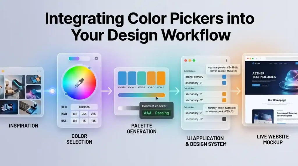
A professional color workflow looks like this:
- Research — Study competitor colors and industry norms
- Ideate — Use Color Hunt or Adobe Color for inspiration
- Generate — Build your full palette in Coolors or Figma
- Validate — Run accessibility checks (WCAG 4.5:1 minimum)
- Document — Define semantic color names and CSS variables
- Implement — Apply via design tokens or CSS custom properties
- Test — Review in dark mode, on mobile, and across screen types
For developers, this workflow often intersects with other tools. You might use MegaFreeTools Image Compressor to optimize color-heavy hero images, or MegaFreeTools Image Resizer to prepare assets in multiple sizes before implementing your color-consistent UI.
Frequently Asked Questions (FAQ)
What is a color picker tool?
A color picker tool lets you select a color visually and get its precise code in formats like HEX, RGB, or HSL. It’s used by web designers and developers to extract, match, and document colors for websites and apps.
What is the best free color picker tool for web designers?
The best free options include the MegaFreeTools Color Picker for quick lookups, Adobe Color for palette generation and accessibility checking, and Coolors for creating full 5-color palettes.
How do I find the HEX code of a color on a website?
Open Chrome DevTools (F12), click the “Elements” tab, find any CSS color value, and click it to open the built-in color picker. The HEX code is displayed and copyable directly.
What is the difference between HEX, RGB, and HSL?
HEX is a 6-digit code for web use (#3B82F6). RGB specifies Red, Green, Blue values (0–255). HSL stands for Hue, Saturation, Lightness — the most intuitive format for creating color variations.
How many colors should a brand color palette have?
Most brand palettes have 2–5 colors: one primary, one or two secondary, and one or two accent colors. Design systems also include neutral and semantic (error, success, warning) colors.
What color contrast ratio is required for accessibility?
The W3C WCAG 2.1 standard requires a minimum contrast ratio of 4.5:1 for normal body text (AA compliance) and 7:1 for AAA. Large text requires a minimum of 3:1.
Can a color picker extract colors from an image?
Yes. Tools like Adobe Color’s “Extract Theme” and some browser extensions can upload an image and generate a full color palette from its dominant colors.
Which color picker works best with Figma?
Figma has a built-in color picker with hex, RGB, and HSL support, plus color style libraries. Coolors also offers a Figma plugin that lets you sync palettes directly into your design files.
How do I create a color palette for a website?
Start with your brand’s primary color, then use a harmony rule (complementary, analogous, or triadic) in Adobe Color or Coolors to generate supporting colors. Always verify all pairings meet WCAG contrast requirements.
Are online color pickers safe to use?
Yes. Browser-based color pickers like the MegaFreeTools Color Picker run entirely in your browser, require no account or download, and handle no sensitive data.
What is color psychology in web design?
Color psychology studies how colors affect emotions and behavior. In web design, blue builds trust, red creates urgency, green signals growth, and black conveys luxury. Choosing colors aligned with your brand’s purpose improves user perception and conversion.
How do I choose colors for dark mode?
Dark mode palettes invert the typical hierarchy: use dark neutral surfaces (not pure black), light text (not pure white), and muted accent colors to reduce eye strain. Maintaining WCAG contrast is equally important in dark mode.
Expert Summary
Choosing the right color picker tool isn’t just about finding pretty colors — it’s about building a deliberate, consistent, and accessible visual language for your product or brand. The tools covered in this guide — from the instant simplicity of the MegaFreeTools Color Picker to the depth of Adobe Color and Coolors — give you everything you need to move from inspiration to implementation with confidence.
The most effective designers combine multiple tools: a palette generator for creative exploration, an accessibility checker for compliance, and a documented color system for long-term maintainability. Whether you’re a solo freelancer or part of a product design team, these tools are the foundation of professional color work.
🚀 Ready to Design Better? Explore MegaFreeTools
MegaFreeTools.com is your one-stop library of free, browser-based tools for designers, developers, content creators, and students. No downloads, no sign-ups — just instant productivity.
Explore tools you might need today:
- 🎨 Free Color Picker — Get HEX/RGB/HSL codes instantly
- 🖼️ Image Resizer — Resize design assets in seconds
- 🗜️ Image Compressor — Optimize images for web performance
- 🔤 Case Converter — Format text for code and content
- 📄 Word to PDF — Share design specs as PDFs
- 🔗 QR Code Generator — Create QR codes for brand assets
- 🧹 Background Remover — Clean up product and logo images
- 📝 Online Notepad — Log color codes and design notes
- 📊 Keyword Density Checker — Optimize your design blog content
- 🔐 Password Generator — Secure your design tool accounts
→ Browse All Free Tools at MegaFreeTools.com
Have a question or tool request? Contact the MegaFreeTools team — we’re always improving our toolkit based on real designer feedback.
Last updated: June 2026 | Category: Web Design, Color Tools, UI/UX